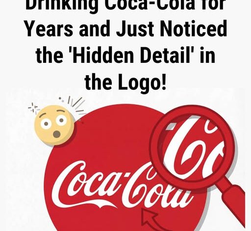
People Are Spotting a ‘Hidden Detail’ in the Coca-Cola Logo
The Smile We Invented
It happens in an instant.
Someone points it out — and the logo changes forever.
That second “C” in Cola stops being a curve of ink and becomes something else: a smile. Once seen, it can’t be unseen. The letter seems warmer, more human, as if the bottle itself were glad to meet you.
Was it deliberate design or the mind’s desire to find friendliness in the familiar?
A History Without Intention
The script was drawn in the 1880s by Frank Mason Robinson, a bookkeeper who gave the name Coca-Cola its flowing Spencerian grace. There’s no surviving memo, no sketch marked “add a smile.” Everything points to ornament — not emotion.
And yet, somehow, we see joy in the sweep of a pen. What began as decoration has become affection.
The Mirror in the Brand
This is where the story turns from typography to psychology. The logo hasn’t changed — we have. The human brain is built to find faces in clouds, patterns in noise, warmth in motionless curves. Over a century of advertisements promising happiness and comfort taught us what to see, and now we can’t help but project it back.
The so-called smile of Coca-Cola may not have been drawn on purpose, but it exists — sustained by millions of quiet associations, by childhood summers, laughter, and red-and-white nostalgia.
The Deeper Design
Every powerful symbol lives a double life: one in the archive, one in the collective imagination. The file shows ink; the heart sees expression. Somewhere between them lies the real design — not a shape drawn by hand, but a story drawn by memory.
In the end, the smile is less about Coca-Cola and more about us — proof that even in letters and logos, we keep searching for signs that the world is glad we’re here.